PROJECTS

About Decodex ↑
Decodex is a UX/UI case study of a responsive web app that was designed over a period of 2 months, from May 2022 to June 2022, with myself as the sole UX Designer. Decodex was designed as a language-learning mobile app, for users to create and share their study tools and progress.
Purpose
Decodex was created for the UX Design course at CareerFoundry, to familiarize the designers with the process of UX Design and develop research, design, and evaluative skills.
The Problem:
People needs a platform where they can study languages with both simple materials such as flashcards and in real-world contexts. They want to not just learn the language, but practice using it with others.
Our Solution:
Decodex's goal is to design an engaging vocabulary app where people can create and share their study materials, build a community among fellow learners, and find partners for language exchange.
Research ↑
The initial research phase was divided into two major parts: competitive analysis and user research.
Competitive Analysis
Four existing apps were investigated and analyzed during this process: Quizlet, Rosetta Stone, Atlas Vocabulary Builder, and Word Booster. Overall, they were pretty straightforward in usage, though some lacked the onboarding necessary for users who weren't already accustomed to certain features. They all provided a measure of tracking progress throughout a language or lesson. Some even provided audio and visual content in addition to standard vocabulary practice aids.
User Research
After doing some initial competitive research to get a lay of the land, I chose 6 people to interview, all of whom are currently studying secondary or tertiary languages. The goal was to understand how and why they learned foreign languages, how they studied, what was important to them during the learning process, and where they ran into the most frustration. Addressing the common threads found among learners helped me decide what features Decodex should focus on.
Key Discoveries:
People often come across new words in an authentic context (reading, watching TV, listening to music) and look up their meaning.
Most learners are interested in learning the language conversationally, rather than fluently. Some are interesting in studying for official proficiency exams, but most place more importance on interacting with native speakers as an end goal.
People feel frustrated if they try to learn new vocabulary and grammatical constructs without natural context, and many find it easier to learn vocabulary and grammar if they learn it within specific scenarios.
Many people don't have large block of time for studying available, and study in shorter, more flexible time periods.
Most people enjoy having a sense of accomplishment and progress as they study, but if the rewards for progress come too easily, they become annoyed and lose that sense of achievement.
Learning a language requires a lot of self-motivation and a variety of ways to study and practice the language.
Ideation ↑
Once I'd gained a better understanding of my users and goals through research, I created user personas and identified what they would need from my app, and what their journey might look like. The persona I developed took from shared characteristics and motivations I'd identified during my user interviews, to create a representation of my target audience.
User Personas
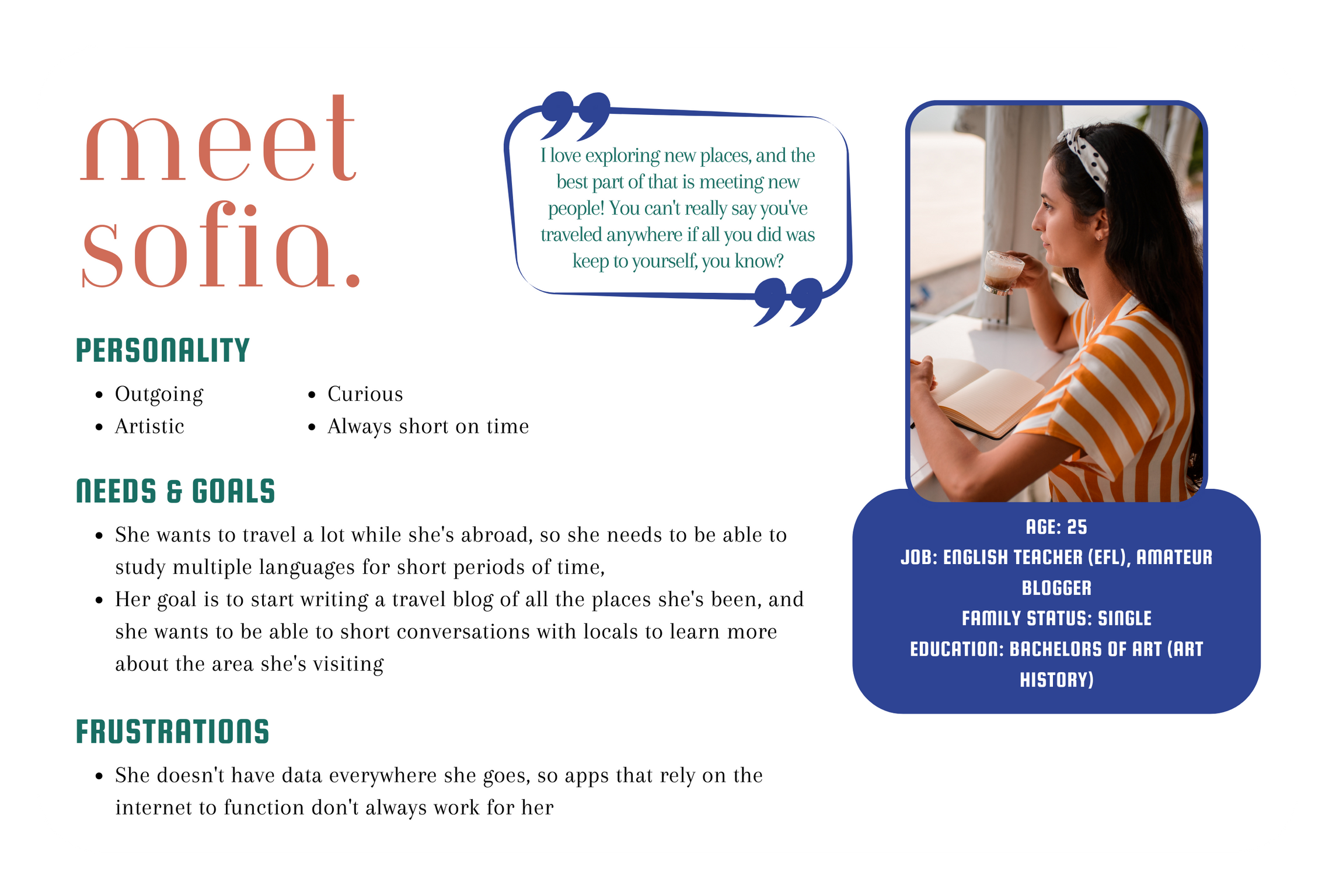
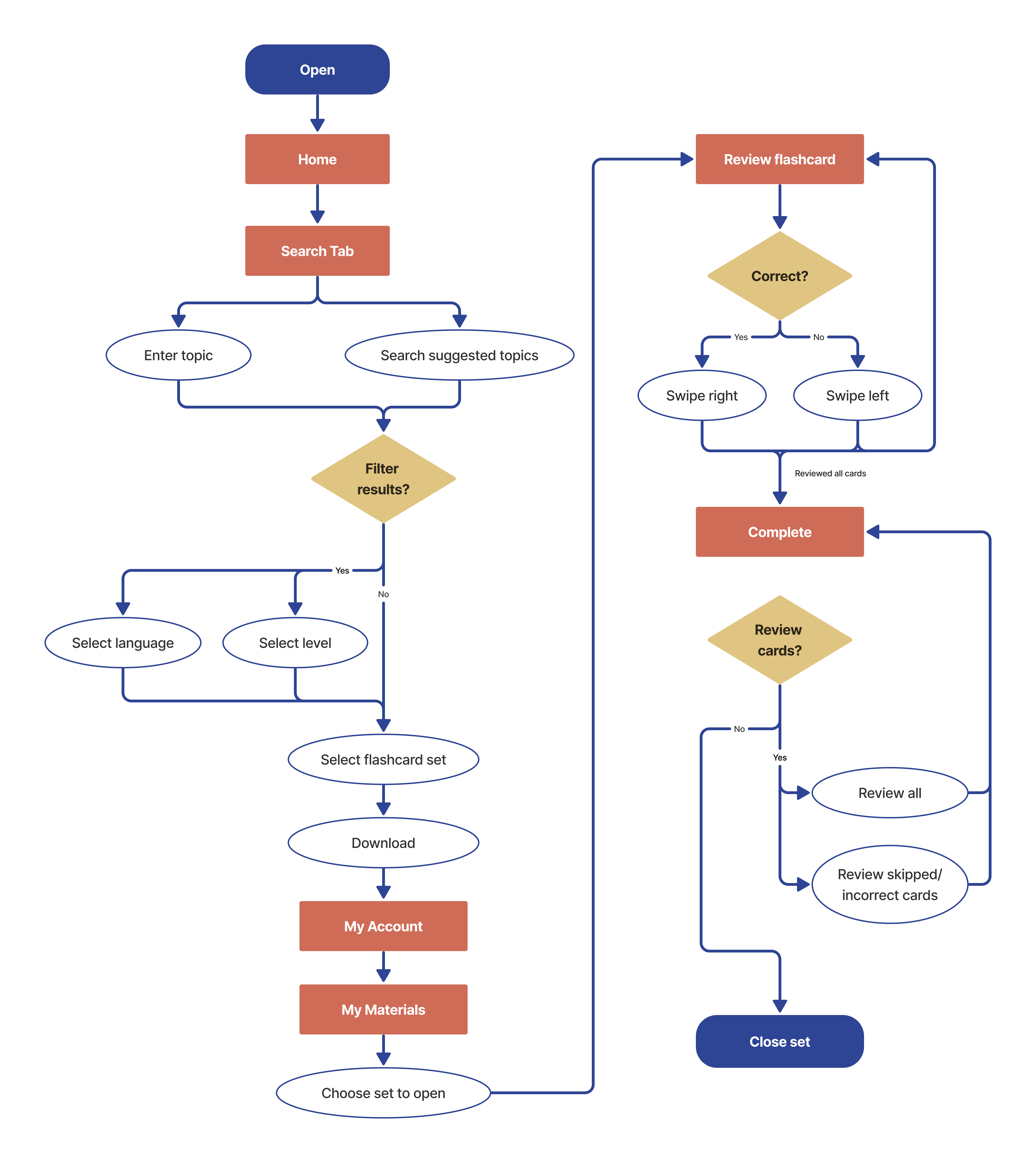
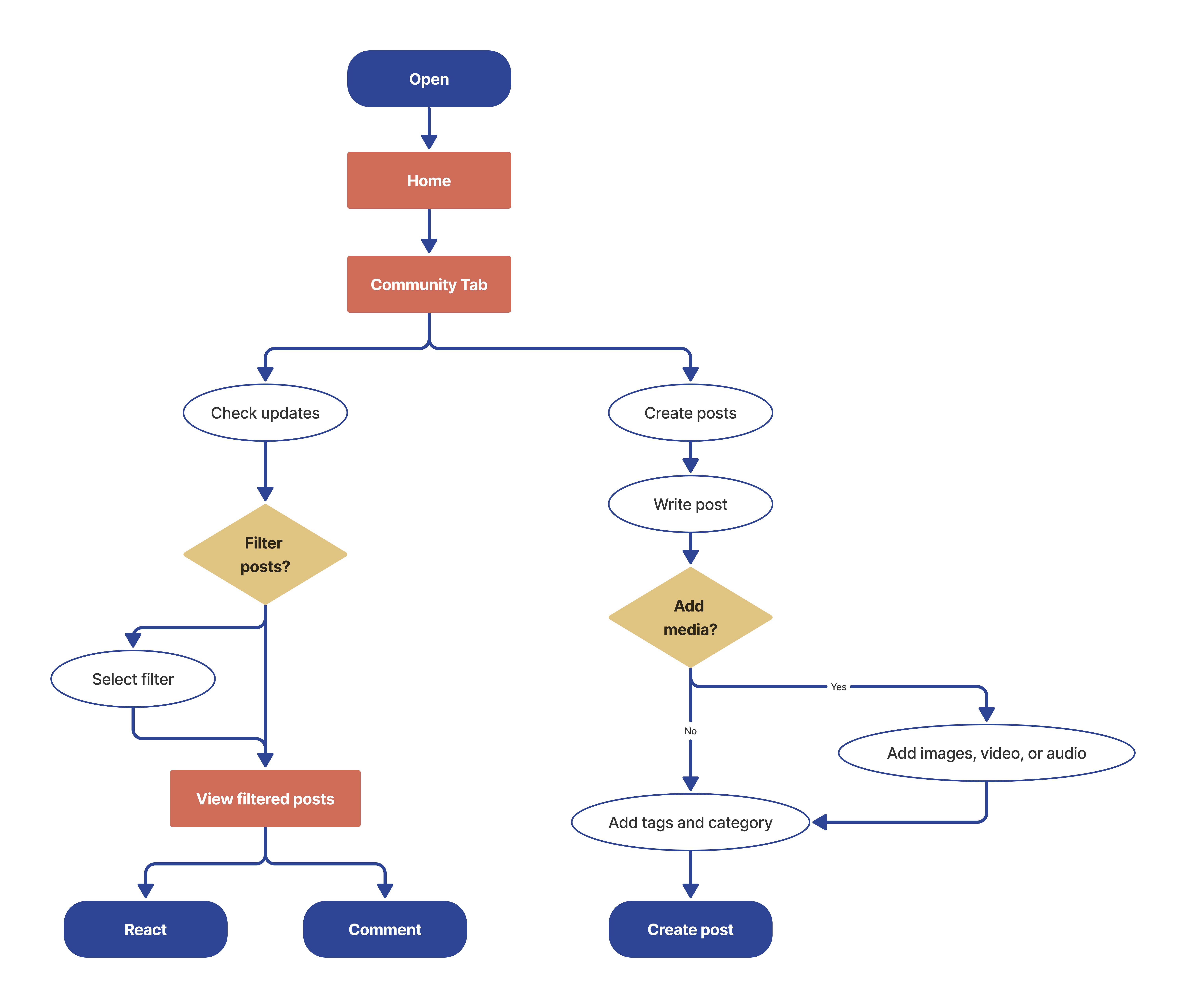
Based on Sofia's goals and needs, I started building my user flows around the major tasks she would complete on my app. As it was still early days in the project, I started with some of the main features of my app: downloading and reviewing vocabulary, and interacting with a community of learners.
Flow #1: Download a vocabulary set to review while traveling.
Flow #2: Interact with a community of learners.
Wireframes ↑
During the wireframing page, I considered my previous findings about what users desired, and what screens would be necessary to create those features for them. To start with, I digitally sketched out the low-fidelity wireframes that were necessary for some of the main features of the app.
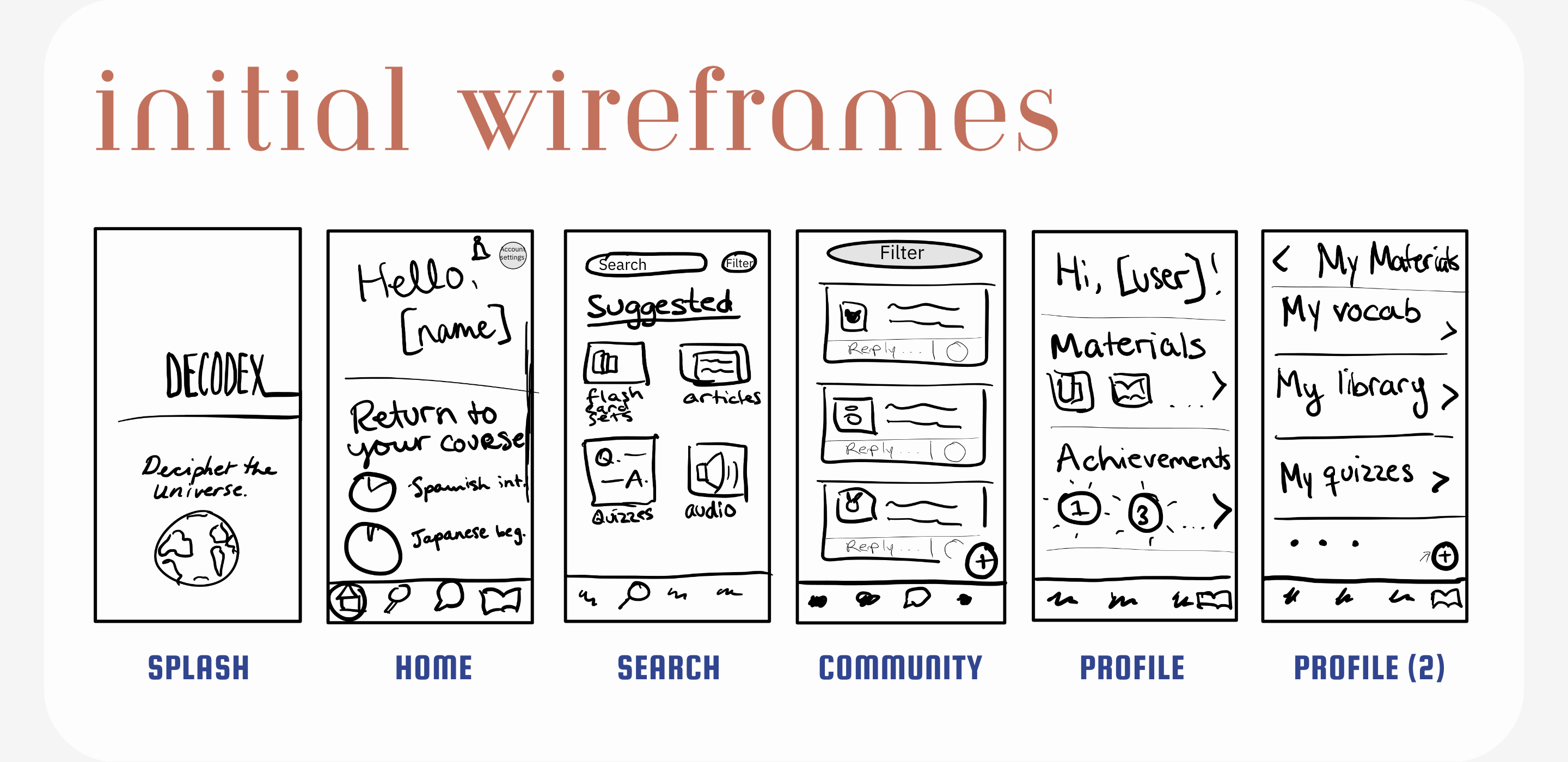
These initial wireframes were developed further into mid-fidelity wireframes, with more details and text. These were used for an interactive prototype that was used for user testing.
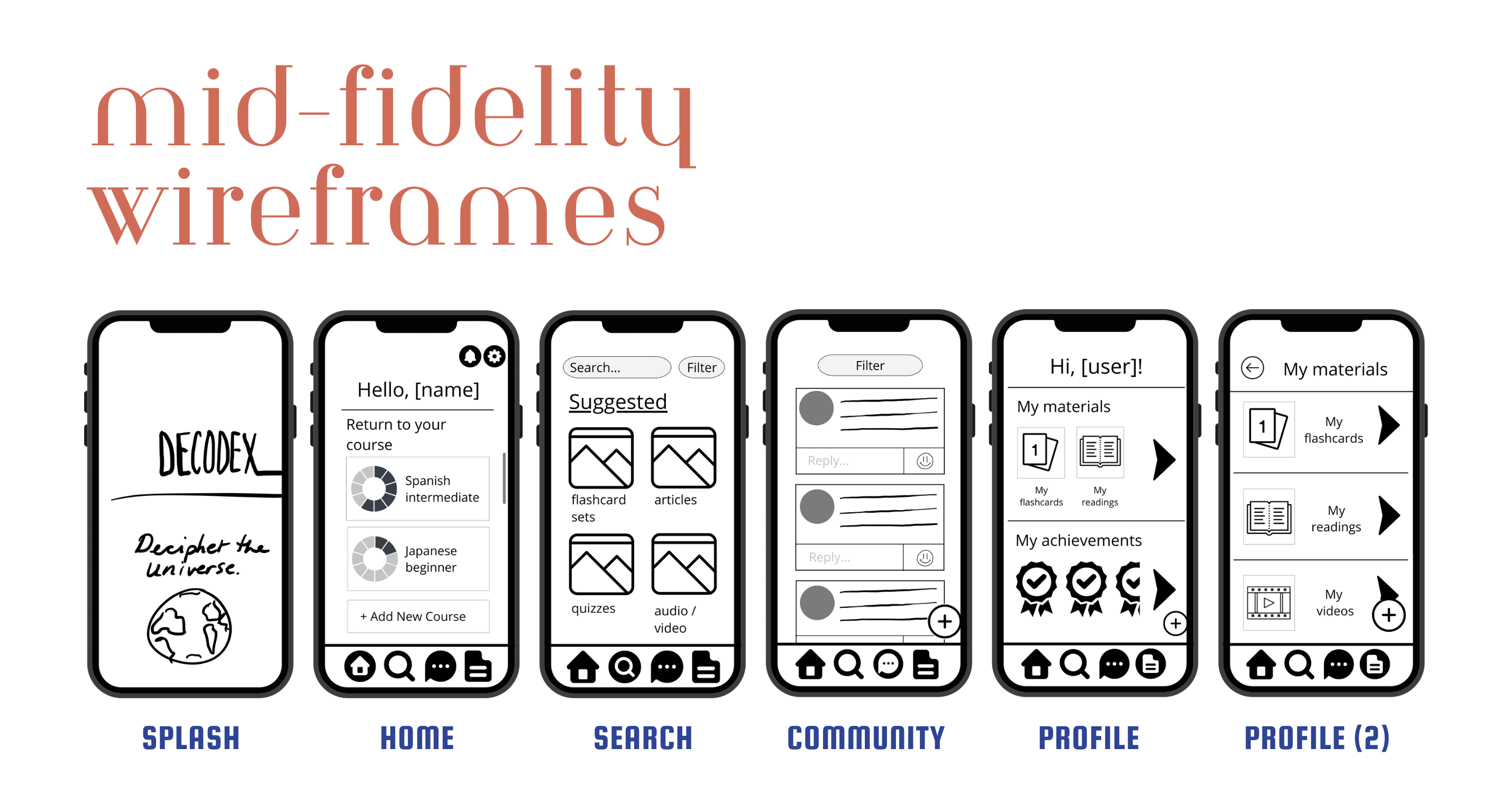
User Testing ↑
Test Goals
Assess learnability and usability of the Decodex app. In order to standardize results, all users were given the same tasks to perform, and tested the prototype on the same device type, mobile.
Test Objectives
Navigate the app and find a specific flashcard set.
Create a new flashcard set.
Interact with other users and write a post.
Methodology
5 participants
In-person moderated testing
15 minute test sessions
Recorded sessions
Users are given a short briefing, then asked to think aloud as they proceed to complete tasks using the Decodex app on their smartphone. At the end, follow-up questions were asked to better understand process.
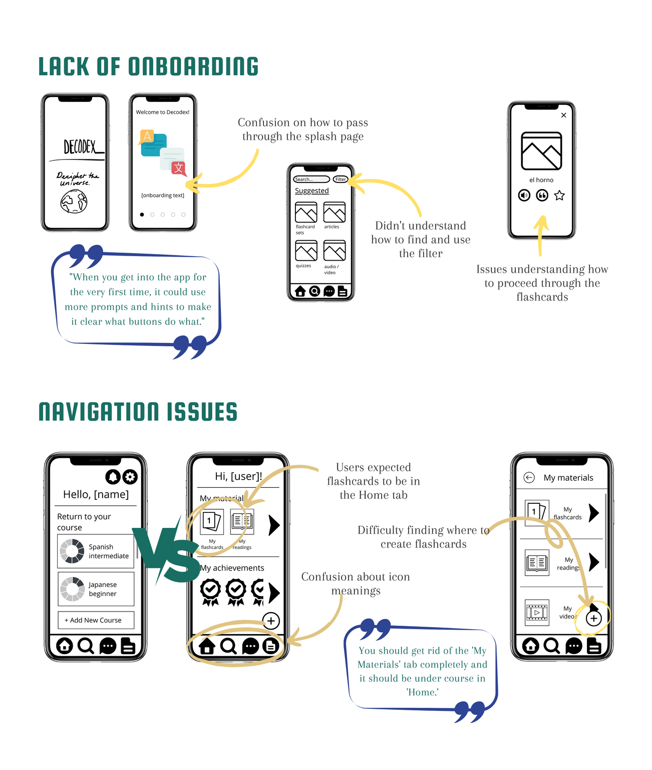
What went wrong?
During the user testing phase, the major usability issues uncovered could be sorted into two camps: confusion and misunderstanding due to lack of onboarding, and navigation issues.
Key Changes
Coachmarks were added throughout the app, as users who weren't accustomed to using language learning apps struggled greatly with understanding how to use parts; in particular, an optional tutorial for using flashcards was added.
Icons were revised to be clearer, and text was added as a supplement.
Filters were changed to dropdown menus available beneath the search bar, to eliminate confusion over location.
The saved materials tab was combined with the home tab based on user recommendation.
Final Design ↑
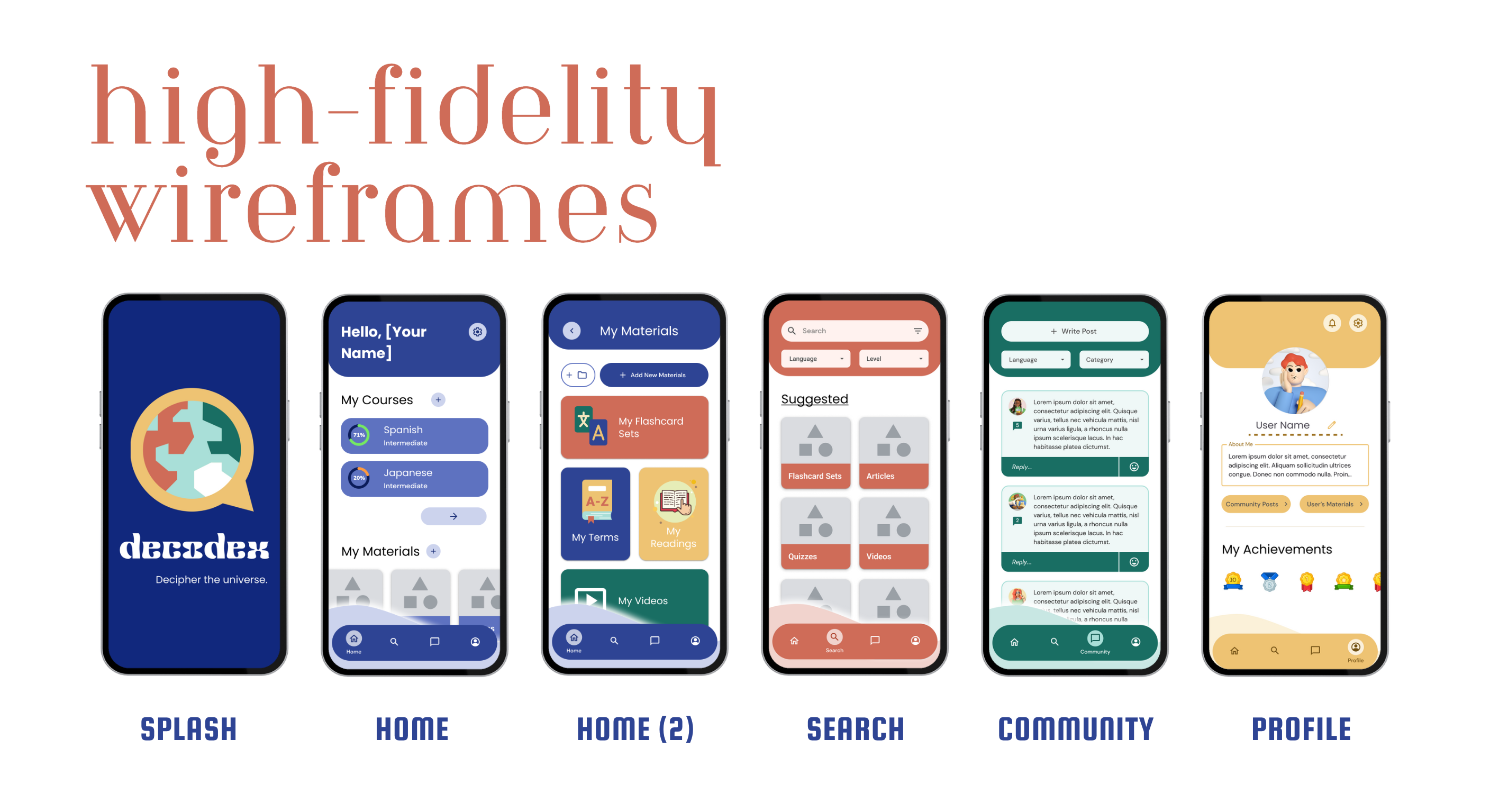
With the data from testing out my prototype, it was time to revise my designs into usable, and then refine those screens into something worth selling. I took a lot of feedback from various parts of my network to turn my rough outline into something usable; as it was my very first set of high-fidelity wireframes and prototypes, I needed a lot of eyes on the project! Creating my wireframes gave me a crash course in using Figma, and I drew from Google's Material Design 3 to create something simple but clean and attractive, while adding my own twist to the style.
