PROJECTS
PEER POWER
About ↑
Overview
Peer feedback is a vital part of learning, especially in fields that involve creating visual content. However, many students come to university or workplace environments without having much experience or confidence in the process. Our goal was to design a tool that would improve the peer feedback experience and encourage more engagement between partners.
This project took place during September 2024-December 2024.
Roles:
Team Lead
UX Research & Design
Tools:
Figma
Figjam
Kapwing
User Needs ↑
How can we improve peer feedback?
We started with three main questions:
- What opportunities are there to improve the experience of commenting and receiving feedback?
- How can we encourage feedback that is well-received by the creator?
- How can we promote engagement for both partners in the peer feedback exchange?
As we explored our questions, we decided to focus on improving feedback for visual work, specifically for designers and artists. Through this process, we refined our thoughts into one central question.
"How might we enhance the experience of giving and receiving feedback on visual assignments for art and design students to make it more engaging and well-received?"
Research ↑
Over the course of a month, we focused on three major areas of research.
Desk Research
Researching best practices for peer feedback highlighted the importance of using feedback strategies in order to build confidence and offer constructive feedback.
Surveys
Quantitative analysis about people's feedback preferences, highlighting their tone and medium preferences. Overall, people preferred specific and honest feedback, with positive and balanced feedback close behind; the least preferred tones were complimentary and solely critical.
User Interviews
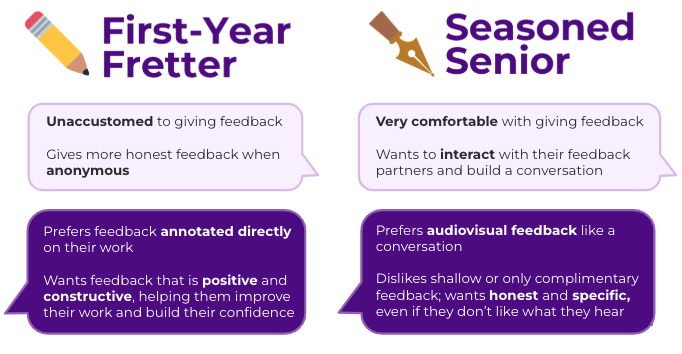
- Users feel as though they need guidance on giving feedback, either through rubrics or by partner request.
- When it comes to receiving feedback, users overall preferred honest and specific feedback.
- A conversation is the ideal form of feedback--without it, users felt that the engagement levels were lopsided and it frustrated them.
- Users are split on how they prefer to receive their feedback; some preferring written comments, others preferring audio comments or video responses, and many preferring a mix of feedback mediums.
- Confidence in participating in peer feedback exchanges grows over time.
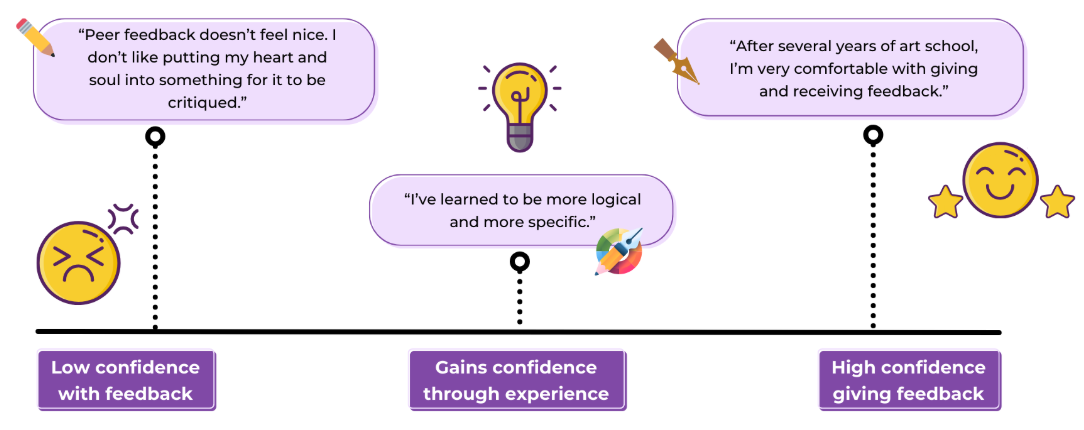
Our insights coalesced into two minimalist personas, focusing on the two major demographics of potential users: those experienced with the feedback process, and those who were inexperienced. We nicknamed them Seasoned Senior and Freshman Fretter, and identified their goals and pain points.
Design ↑
Sketching
During our initial phase sketching out low-fidelity wireframes, we brought a big mix of ideas to the table. Some of the suggestions floated around included mobile designs, incorporating video calls, search functionality for specific projects. After ideation and discussion, we decided on four main features:
- Notification system for comments
- Project canvas where comments could be left as text, audio, or video
- Collapsible sidebar providing feedback guidance
- Preference settings for feedback tone and medium
Prototyping
After discussion, we combined our ideas into a mid-fidelity prototype to prepare for our user tests. We created four main pages for our initial test.
- Home dashboard: View uploaded projects and community projects
- Profile pages: Add classes, set feedback preferences, and customize dashboard
- Add project: Upload file of work, select the class and assignment, and adding optional notes for peer feedback partners to view
- Project canvas: View works, with an annotation bar that offered a choice of comment mediums and collapsible sidebars that provide additional information about the project, as well as offering suggestions and support on giving feedback
User Testing
Methodology
- Remote testing, moderated over zoom.
- Our primary tasks were uploading a project, and viewing and replying to peers' comments.
Key Discoveries
The primary issue we uncovered was a lack of clarity in our design. Icons, labels, and processes that had seemed so clear to us were confusing to first-time users--a classic case of overfamiliarity blinding us to the ways our choices could be misinterpreted.
- Icons and microtext that specified the tone of feedback users wanted to receive, as well as the medium they wanted feedback in, were unclear to our testers. While after some exploration of the platform, their meaning became apparent, they were not as intuitive as we'd hoped.
- Other labels like the community page and aspects of the add project page prompted some confusion, and users had different opinions on what they were for.
- We also focused on developing a simple color palette to improve the visual language of our pages. Blues and reds that complemented our primary purple color were used to highlight changes in status.
- We also made a few tweaks to reduce errors when it came to creating and sending comments, adding popups and simplifying buttons.
With valuable feedback from our user tests, as well as our own audit of heuristics and visual design principles, we worked on improving our designs. We also built a UI kit for our high-fidelity prototype. Our final design (for now!) can be seen in the demo video at the top of the page.